China Airline Rebranding →
中華航空識別再設計
中華航空是台灣知名的航空公司,臺灣最大民用航空業者,為華航集團的核心企業。主要轉運樞紐為桃園國際機場,總部則設於鄰近桃園國際機場的華航園區。目前以經營國際航線及兩岸航線為主,航點遍布30個以上國家及地區。
It is the national airline of the Republic of China and the largest civil aviation company in Taiwan. It is the core enterprise of China Airlines Group. Its main transshipment center is Taoyuan International Airport, and its headquarters is newly located in Huahang Park, which is close to Taoyuan International Airport. At present, it mainly operates international routes and cross-strait routes (including passenger and freight), and the destinations are spread over 30 countries and regions.
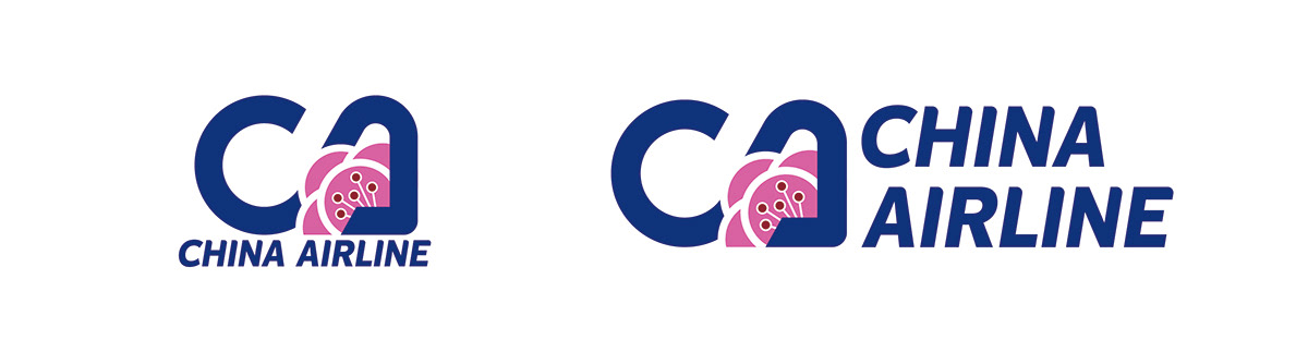
此次重新設計主要抓取中華航空原視覺的重點配色,依照同等比例進行配置,並抓取中華航空最為代表性的標誌-梅花,做為視覺主軸,而現代大多的航空公司標誌會由其名稱開頭簡寫作為設計出發,因此我抓取China Airline開頭的C與A作為主要的文字意象。
This redesign mainly captures the key colors of China Airlines ’original vision, and configures them according to the same proportion, and captures the most representative symbol of China Airlines-plum blossom, as the visual main axis, and most modern airline logos will be named by their name. The opening abbreviation serves as a starting point for design, so I capture C and A at the beginning of China Airline as the main imagery.
整體風格不同於以往識別較為傳統的書法體,利用簡潔的幾何切線以及流線造型,試圖與航空公司的整體進行連結,提供快捷且完整的服務品質。沒有過多的裝飾,讓整體風格更具備現代感。
The overall style is different from the traditional calligraphy that was recognized in the past. It uses concise geometric tangents and streamline shapes to try to connect with the airline as a whole to provide fast and complete service quality. Without too much decoration, the overall style is more modern.


